A closer look at our thoughts and work
Inside the Blog

Landing Page Design
A Landing Page is a dedicated web page designed to achieve one specific outcome, such as promoting a service or gathering leads. Its strength lies in simplicity: by removing competing content and emphasising a single call to action, it provides clarity, improves user experience, and increases the likelihood of conversion.

Enhancing Spatola CPA Website
I recently refreshed Spatola CPA’s Squarespace website, improving structure, clarity, and usability.
With updated pages, a new blog, videos, a contact form, and a location map, the site now feels more intuitive while staying true to the original branding.
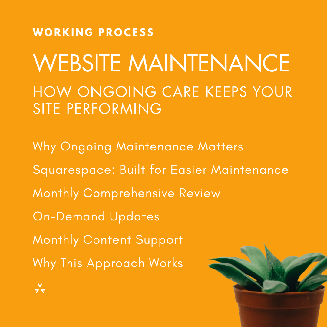
Website Maintenance: How Ongoing Care Keeps Your Site Performing
What ongoing website maintenance actually looks like, and how this service provides the consistent care your website needs to stay accurate, fast, and aligned with your goals.

Why Your Website Needs Both Strategic Updates and Ongoing Care
Your website is your business’s digital home, and it needs regular care to stay accurate, effective, and aligned with your goals. Even if the design still works, your content and strategy can quickly fall behind as your services evolve and your audience’s needs change.
To keep your website relevant, two types of updates matter: a focused, one-time refresh to realign your message, and ongoing updates that continuously optimize performance. Together, they ensure your site reflects who you are today and supports your growth.

Website Redesign: When a Refresh Becomes a Strategy
Does your website feel outdated or ineffective, even after updates? When small fixes stop delivering results, a strategic redesign can transform your site into a clear, persuasive, and conversion-driven tool.

Squarespace Website Design Plans: Which Package Is Right for You?
Choosing the right web design approach can feel overwhelming. Should you go custom or choose a structured package? How do you know which option fits your business needs and budget?


Why Squarespace is Perfect for Small Businesses
For small businesses, Squarespace combines design freedom and ease of use, and with a professional web designer, it becomes a powerful tool to achieve your goals and communicate your message effectively.

My Journey as an Online Volunteer
Online volunteering has proven to be a rewarding way to dedicate part of my time to supporting nonprofits worldwide, collaborating on exciting projects, connecting with people from different cultures, and realizing that even small contributions can make a difference.

Zarina Mirabdullayeva
I had the pleasure of working with Alexandra through the UN Online Volunteering platform, where she supported Tech4R, a UNDP initiative on disaster resilience.


Client Journey Map
Understanding Your Website Journey: What to Expect from Start to Finish

Website Audit
If you want to know how your website is really performing, get a website audit (a focused review of your site’s design, usability, content, SEO, and performance) and you'll receive clear, practical recommendations to improve what matters most: credibility, user experience, and results.


Jenny Reed
Working with Alexandra was a dream. She really took the time to understand our mission and transformed that into a website that feels joyful, professional and easy to use, both for our audiences and our team.


Anaily Baquero
Alexandra has been helping us with our website and her services have exceeded our expectations.
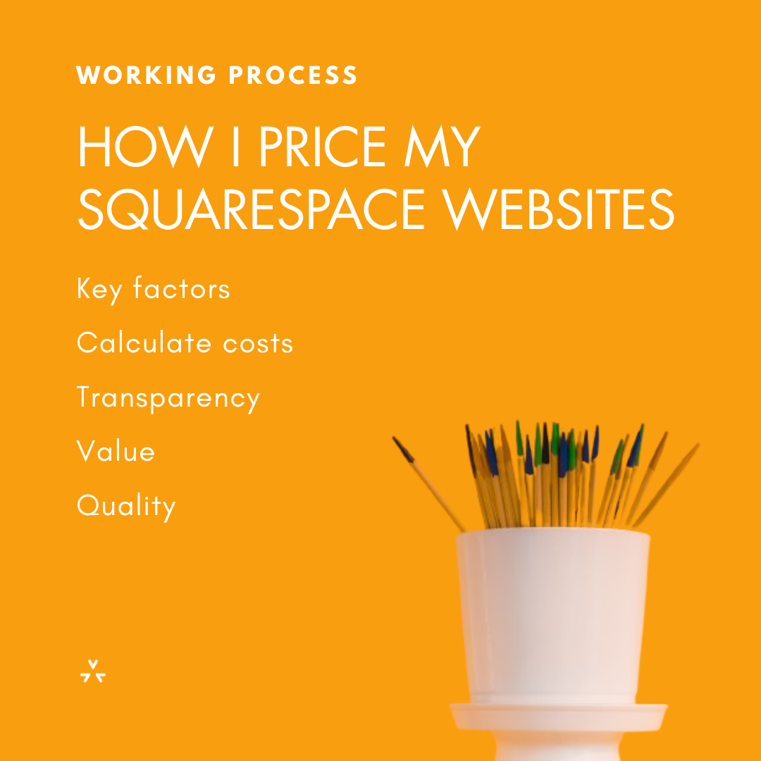
How I Price My Squarespace Websites
Whether you’re a small business owner, nonprofit manager, or independent professional, knowing what goes into website pricing allows you to make informed decisions.